Friday 27 March 2015

7. Looking back at your preliminary task, what do you feel you have learnt in the progression from it to the full product?

Throughout this piece of work i have learnt a lot about magazines in general and the effort and detail that goes into making a magazine look 'professional' a clear indication of the knowledge that i have developed throughout this piece of work is the difference between my preliminary task and my final product.

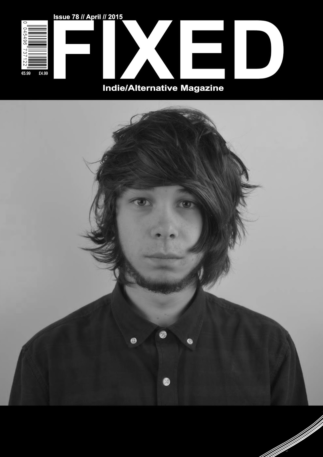
Firstly, the type of shot i took on both magazines has a significant difference in the overall look and style of my magazine. For my preliminary task i took a long-shot and edited it to fill the entire page, this made the photo look stretched and look life the photo was very unprofessional, this contrasts with my final product. For my final product i opted for a more simple mid-shot so there was little risk of it getting stretched. Also the overall design differed from my preliminary task as well. My preliminary task had no borders so this meant i had to add the title of the magazine onto the photo on the magazine, this meant that part of the title went over the models head and i had change the titles colours to white and black instead of just white, which i intended to do, by doing this it warned me not to do it again because it gives the magazine a messy look to it, i implied this into my final magazine by having a border, which allowed a clear space for my title and made sure it didn't go over any of the picture and it was able to go well with my colour scheme, unlike the one on my preliminary task.

On the topic of colour scheme, i learnt that it was hugely significant in the overall look of the magazine. On my preliminary magazine i did not stick to any colour scheme and just stuck to the one that i was given due to my back drop, so i stuck to just a white colour scheme, which didn't really go with what my model was wearing. By now knowing this i was very specific on what i made my model wear, for example on my cover on my preliminary i had a white background and white writing to go with my background, but he was wearing a blue, yellow and red shirt which really didn't go with the colour scheme of my magazine, there is a clear change and clear improvement of knowledge with my final product. With my final product i have stuck to a strict black and white colour scheme (with a slight involvement of grey) this allowed my magazine to look a lot better than my preliminary magazine due to the colour scheme, so overall i learnt a substantial amount from the period of the making my preliminary and my final product

Arguably one of the biggest differences between my preliminary magazine and my final product is my contents page. My preliminary magazines contents page is very different from my final product. On my preliminary contents i had a large long-shot photo covering the majority of the page apart from the bottom which has the date that the magazine came out. My preliminary contents page was significantly different to my final contents, firstly my preliminary contents had little writing on it, so it didn't really give a lot of information about the actual content of the magazine, which is very uncommon in most 'professional' magazines, this is in great difference to my final product, my final product was packed with information about the content of the overall magazine and also the overall design was much better than my preliminary design, as my preliminary contents page was very basic and boring, in contrast to my final product.

Overall i have learnt a substantial amount from the period of making my preliminary magazine to my final product and this is evident if you compare both the magazines.


6. What have you learnt about technologies from the process of constructing this product?

Before i had started this task my skills on certain software was very limited. Since starting this piece of work it has developed my skills a great amount and has allowed me to become more educated on certain software's, which can benefit me in  later life.


Camera
Throughout my entire project the camera I used was a Nikon D300, due to this being the only camera that was available to me. while looking back at my photos, I felt that this camera gave off a high quality image. This camera i feel was very easy to use and this benefited in the duration of my photo taking process. Along with the camera I used a tripod, so that my pictures were steady and still. Also i used artificial lighting and a white backdrop to improve the quality and overall look of my photos, i feel these aspects were a huge factor in the quality of my photos and it enabled me to make the pictures look as professional as possible.


Computers
I used 3 different types of computers through this project. The first computer i used was in fact my own laptop. I used my own Acer laptop for mainly research and planning. Also i used my mums MacBook Air, in which i downloaded photoshop, so i was able to do the actual magazine at home. I also used the standard computers at school, this was for writing the evaluation questions, making the magazine and using them for research and planning. I already knew how to use these computers to an acceptable standard. The computers at school have the Windows 7 software, which i thought was a very good thing to be provided, due to the simplicity and my already able ability to use this software. 


Photoshop
I used Photoshop to construct both my magazine draft and final magazine piece, also it was used during the creation of my preliminary task. I used this software on my mums MacBook. At the start of the course I was not very experienced with Photoshop and found it hard to navigate. However towards the end of the course I was completely fine with it, my skills with photoshop progressed a lot. I learnt how to crop using both the magnetic lasso tool and also how to remove unwanted background from images using the magic eraser tool. Another tool which I frequently used was the spot healing tool, this was used in order to make my models skin clearer. To summarise, I feel that this course has provided me with a good knowledge of Photoshop. 


Animoto
Animoto is an animation feature which i used to present one of my evaluation question and also presented my 25 word pitch in my research and planning.


Slideshare
Slideshare was a feature I had used on the last part of the course when i was working on my evaluation questions, it is an effective way to share slides off of say Powerpoint and Word, this makes presentations look more professional and is easy to out into blogger and the work on it looks very good.


Other sites/Programmes
During the course I used several other programmes when completing this coursework. One of these was Blogger, it was my first time ever using this but i feel it was simple enough to use. I used blogger to post all of my coursework. I also used Spotify, this was to compile a 20 song playlist in my research, i was going to use sound cloud but due to my music genre a lot of my songs were not found on sound cloud but i did have a brief play around with it. I used Google Chrome, a simple thing to use but was vital during my coursework. i used this to complete my research. I learnt how to use all of these to the standard I needed. Another thing that i used was a memory stick, i used this so i could access my work from home. Email was also used in the transportation of my work from school to home and it allowed me to get on with my work at home. 


5. How did you attract/address your audience?

To attract my audience I used the name of the main bands album on the front cover to get the bands soul fans interested and people who do not know a lot about the band interested to know why that is on the cover, which will get them reading about the band. I used to different colours on this subheading, i made one side grey to relate to the black and white effect that is on the main image. On the other side of the text i have made it white, i have done this to relate to the title and also i have done it so it connects to the white pages which are in my magazine and which are present in my double page spread and my contents page.


Also i made the artist have eye contact with the camera to incise the audience and is a key marketing technique used by various magazines. Also i have used a expressionless photo to one enforce my simplistic style of my magazine which relates to a perfectionist type of audience that was an initial thought of an audience of mine but it has became an audience that i have tried to base the cover and my double page spread on. Using the messy hair on my artist allows me to relate heavily to a young alt audience because it relates to the overall style of the young alt genre and will allow my target audience to be interested in the magazine because of the person on the front of the magazine. Also i have enhanced the detail in the eyes on photoshop, which again is a key marketing technique which i used.


I used a pull quote, doing this allows people to see a part of the interview straight away and makes them want to read more of the the article if it meets there interest. Using a quote where he says 'I wanted to be Liam Gallagher' allows for a extended audience to be reached. Including a huge star in indie/alternative music allows for mainstream audience to want to read this article because Liam Gallagher a former lead singer of Oasis is mentioned.


An inclusion of pictures of other bands and individual photos of people from those bands (on my contents page) allowed me to attract my audience. I used 4 pictures of my main artist on my contents to continue my the interest in him throughout, and allow me to relate to the same audience through these pictures, also i used 4 pictures of another band which allowed me to extend my audience and let people who are fans of this band be incised by these photos. The band have a similar indie/alternative genre to them but due to different aspects in their music it allows me to reach an audience beyond the ones that are only interested in my main artist.


In my contents page i have included an in-depth description of what that part of the includes this allows my audience to know what is included. Including a section called regulars allows my consistent readers to be familiar with the content of my magazine.


Another thing that i have used in my magazine to address my audience is using a pull quote saying 'we're on our way to the top' by saying this it shows a sense of self-confidence about the artist, this enforces the relation to Liam Gallagher, due to him having a reputation for over self confidence this allows me to relate to an older 'indie' audience, because of the relation of Liam Gallagher 


At the bottom of my front page i had 4 bands, these bands were selected to reach the needs of my genre. Firstly i put the more traditional sounding indie bands by putting The Twang and The Enemy on there so i was able to relate more to a traditional indie audience. Mallory Knox is a more alternative/rock type of band so this relates to wider alternative audience. I included Enter Shakari because they're different to normal mainstream music due to their alternative/metalcore/Electronicore approach to their music, which no other band really possesses, so with this band i can relate to a more serious indie scenester.


4. Who would be the audience for your media product?


Young Alts


Firstly, young alts are a large part of my target audience that would read my magazine .Young Alts are young people who ‘want out’ of the mainstream agenda. Equally split between the sexes, and members share an inquisitiveness for everything Alternative. Young alts Experiment with art, music and fashion unites the Young Alts, who are dipping in and out of scenes. Young Alts are likely to gravitate towards Leading Edge Tribes once they've figured out what they’re most interested in, but for the time being Young Alts are happy to get stuck into as much media as they can – from reading Penguin Classics on Kindle, streaming ‘Girls’ on Netflix (even the boys) and checking out the latest music on Spotify. Skater, Emo and Hipster trends are most commonly tried and tested by the Young Alts, it’s about keeping an open mind. This audience is very suitable for my magazine and i feel my overall style has a clear representation of that and the bands and the way i speak in the magazine gives a clear indication of my representation of that audience.


Indie Scenesters

For another part of my audience i chose indie scenesters. Indie Scenesters are dedicated to finding the newest music, exploring all avenues to get there online, print, record shops, club nights and word of mouth. Staying ahead of the curve is a must for indie scenesters, but it’s borne out of a genuine love for music. For Indie Scenesters, discovering new artists is a key thing for them and they strive to find them. Guitar music is a common factor in making an 'indie scenester' and i have incorporated this into my magazine by including a variety of different guitar bands, from all genres. In recent years Indie Scenesters have broadened their musical tastes as a result. It’s no longer just about indie rock bands like Vampire Weekend Indie Scenesters have embraced experimental, genre-blending artists like Four Tet. Yet, the Indie Scenester approach remains the same  it’s about championing independent artists rather than a specific genre, especially before the masses get in on the act. Potentially having their own music blogs, The way i have included bands such as enter shakari, there genres include alternative metal and electronicore, these genres are very uncommon and relate heavily to the modern 'Indie Scenester'. The genre of music that is included in my magazine is a clear indication to the type of audience that would read my magazine.

Overall i feel my magazine has a good representation of the audience that i want to read it and feel it would appeal to them greatly.


Thursday 26 March 2015

3. What kind of media institution might distribute your media product and why?

An institution that would publish my magazine in IPC media, IPC media publishes NME, which is the magazine which is most like my magazines musical genre and also there is always a gap in the market for an indie/alternative magazine like mine. IPC is a wholly owned subsidiary of time inc., it is a consumer magazine and digital publisher in the United Kingdom, with a large portfolio selling over 350 million copies each year.  IPC Engages with almost half of all UK adult prints and their website has reached over 28million members, due to this i will have the benefit of the experience with this company which would benefit the making and marketing of my magazine. My magazine will be sold in various higher end independent clothes stores due to the style of my magazine and how it relates to an indie audience and will be a common place for them to get there 'extra-ordinary' clothes, also i would like my magazine to be purchased by more mature and sophisticated males.


Friday 20 March 2015

2. How does your media product represent particular social groups?

For my audience research I looked an Indie Scenesters and Young Alts. My magazines style is a clear representation of the Young Alts, this is in relation to clash magazine (the magazine I have took major inspiration from) but the music and actual content of the magazine is a clear relation to Indie Scenesters, my style of magazine is a clear representation of the type of people who'd read my magazine.


My Artist is a front man of an Indie/Alternative Band called Ritz To Rubble, the way he acts is similar to people like Liam Gallagher, Ian Brown, James Cocker and Van McCann. My artist doesn't take himself too seriously. My artist is a very out spoken and big headed character, this is a relation to front men of the past in this music genre. The way that my artist never really has much emotion on his face is due to the fact his personality has been related to people like Liam Gallagher, Ian Brown, James Cocker and Van McCann and they all commonly use an expressionless face when having there photo taken.

This magazine doesn't really fit the overall style of my magazine, but the way in which the photo is taken is a style I tried to replicate.

The overall style of my magazine is one that would relate to clash magazine, i chose to try and replicate this style due to the type of people that would buy clash magazine and i have incorporated the layout and style into my magazine. My artists, suits my magazine and also has a good representation of the overall audience of my magazine. Also a clear representation of my target audience is shown on my front cover and contents page, with the type of bands that are displayed on them. My target audiences are young alts and indie scenesters and this is clearly represented with the types of bands that are on my cover and contents. For example for Indie Scenesters i had two smaller 'Indie' bands in Drowners and Skaters, who are both upcoming indie bands, these bands and their music would relate to my target audience to a great extent. Also i have tried to relate to a young alt type of audience by including 'Enter Shakari'. Enter Shakari's music genres are Experimental metal and Alternative Rock. By including this type of band relates to a hardcore 'young alt' because of the individuality of the music that they play. I have also related to young alts with inclusions of bands such as 'Mallory Knox, 'The Enemy', and 'The Twang'. I used YouGov profiles and UK Tribes to discover what type of audience that would be best to relate to, considering my magazines overall style. My artists overall style is an adaption to people such as 'Van McCann' (lead singer of catfish and the bottlemen) i have adopted his style because it is very simplistic and relates to my magazine, it may not relate directly to my target audience but i feel the way his personality is, he is able relate my audience to a good extent.